 Simpsons (above, and to whom I am very grateful)
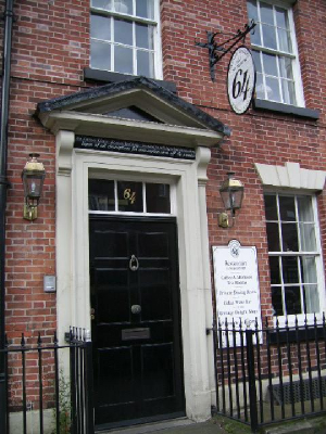
recommended me to the owners of 'No.64' to supply the signage to their recently acquired and completely refurbished three
storey 'Georgian townhouse' premises just a few metres down the road. It was to be a restaurant,
patisserie, tearoom, shop, cellar-winebar and eventually I think a b&b. My job entailed: Supply
& fit of wrought iron hanging sign, wooden wall sign and several polished oak hand lettered interior door
plaques for each room. The numeral 64 was glass gilded using a traditional technique on the middle pane
above the front door. Above that, a 'sale of alcohol' legal notice was hand-done in 'copperplate script'
style. For the pavement I supplied a 'posh' taller than normal A' board which I built strongly and well
finished-off, complete with polished brass hinges and the 'Cottage Delight at No.64' emblem protruding in relief
over the top. I also painted a couple of things in acrylic on the interior walls, including a grapevine illustration
with arrow pointing downstairs to the cellar-winebar. Cottage Delight are still a thriving company producing speciality foods
but sadly the ambitious No.64 recently had to close down.
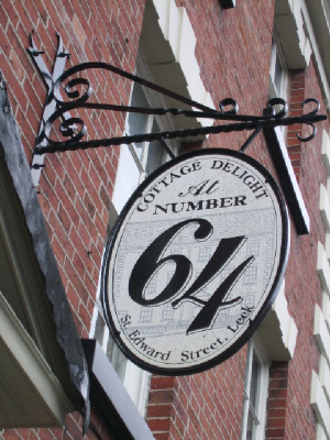
After being given the oval No.64 design, I drew a sketch of what I thought the sign could look like. It was quite rough
but I managed to communicate the idea to the boss who told me to go ahead and make it. I then approached 'Izaac Walton
Smithy' now of Swynnerton, to fabricate the sign in wrought iron, which they did brilliantly. I received
it in its bare-metal state and treated, primed & coated it with specialist paint. Then I executed the signwriting
in black & grey enamel. Finally I fixed the heavy sign to the brickwork with steel nuts & bolts set
into holes using a two-part chemical adhesive. Some may think that the type of attention to detail
I have shown on these jobs is unnecessary. I don't buy this as, most of the proprietors I meet are very exacting.
Even when cost is invariably a major factor, I try to give people what is asked for and hopefully, satisfaction.
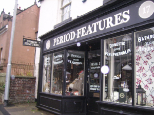 Period Features is situated just around the corner from No.64. and although my involvement wasn't the
result of a recommendation. When I informed the proprietress - Lucie Storrs - of the other work I'd done close by,
she hired me straight away (nothing to do with the fact that I already knew her partner Pete). Part of the business here deals in antique fixtures & fittings, so I was easily
supplied with a rotten and bent up old Post Office swingsign to resurrect. After I'd made a new wooden sign to fit the once
straightened bracket, I painted it including all the exterior signwriting with 'Farrow & Ball' matt
exterior paints which retail at the shop itself. It's difficult to see from my poor photo that two subtle colour
tones were used on the exterior lettering to add to the Victorian feel to the fascia. Lastly, all the lettering on the glass
I supplied in vinyl and fitted to the back of the glass in reverse, to read correctly when viewed from the street.
___________________________________________
 Construction and painting of all exterior
signs is substantial. Exterior plywood board of 12 or 18mm is glued and nailed into a routed-out recess in a soft or hardwood,
profiled frame. All corners are precision mitred, glued and held with large screws. Paintwork usually consists of
two coats of oil based primer, any filling and flatting-back are carried out where necessary, one undercoat and two coats
of high quality gloss. This particular sign has a hardwood frame and the addition of its own protruding sloped roof for
shedding water and so prolonging the look and life of the sign.
_______________________________________________
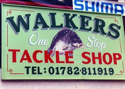
The Mirror carp was poached.... from
a magazine. I intended it to appear as if it was 'looking out' from between the lettering by using the angle
of the 'pose'. Painting its tail end 'behind' the lettering and painting the dorsal fin 'in front of'
the top lettering I think was effective. Where the broken red stripes met, the corners were decorated with barbed fish
hooks. Alas the shop has now become a grass verge :-(
____________________________________________
 Old English style lettering in 23 carat gold leaf on matt black background. Not my
vision, just acting under instructions from a talented designer. The gilding was probably my - usual - recommendation.
Gold metallic paints tend to blacken in time, whereas real gold withstands the elements and never tarnishes ever. It
is so thin and goes so far but the cost of gold leaf fluctuates. However, it may be less expensive than you would
expect so, please ask!
All the white interior walls were marked out in pencil, the black then painted in using large
signwriting brushes.
____________________________________________
P. T. Miles is a long established
Jewellers situated in Newcastle U Lyme. The old and now perished sign had been supplied by another local tradesman. The
owner wanted the new sign to be virtually identical to the old one and asked me to do the work. I gilded the main title in
23 ct gold leaf and added a red outline. A block shadow was added in black and, the gold was varnished. Two painted panels
were added to the space at either side of the title, the outlines of which were masked out. Masking of letters for both panels
were then set out, cut by hand and applied to the surface which was then painted light blue. A sponge was then used to
apply a lighter blue random patterned finish then, more sparsely the same in dabs of white. When dry the masking
was removed and red outline added. Highlights and shadow added to make the letters appear as if carved into the
surface revealing the blue beneath completed the effect.
________________________________________
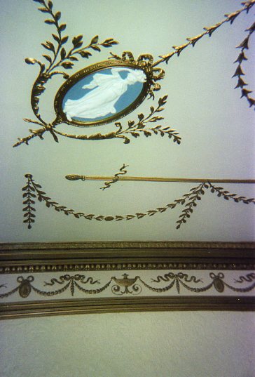
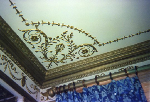
The white figurine on blue cameo ceiling decorations are a clue to the past family connections to
this large and grand country residence in Moddershall. That's right, it was Wedgwood. I was also told that some of the
exotic flora in the garden had been put there by Charles Darwin himself. I was asked to make surface repairs to cracks in
two ceilings. One - the largest - was covered in cracks and, as any decorator or restorer will know, the best way
to repair a crack is by first making it bigger - which I did. To be then filled and sanded. Both ceilings repainted completely,
gold detail painting to endless amounts of plaster relief work and repainting the cameos, all this ended up taking
about a week. To be done by proffessional restorers, this work would have cost several thousand pounds. I did a
good impression for a fraction of this, my efforts had been considerable and I was very pleased with the final result.
However....after somebody's demeaning attack on my efforts, a roof raising argument and wiping that somebody's
saliva from my face (fired at point blank range), I went home shaking with rage and the extremely bitter memory
of the experience eats me still as I write. All the jobs I do are tackled with confidence and, I am often my own harshest
critic. If I say I can do it, I can do it and have stretched my abilities and resources many times to complete a job well.
 ________________________________________
And finally, for Little Treasures Day Nursery, a floating ted!
________________________________________
Contact me by
TELEPHONE:01782 325863
MOBILE: 07951 848059
Or
email at
enquiries@robwagg-sign.co.uk
|


