|

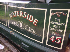
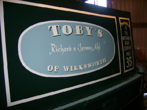
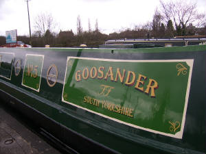
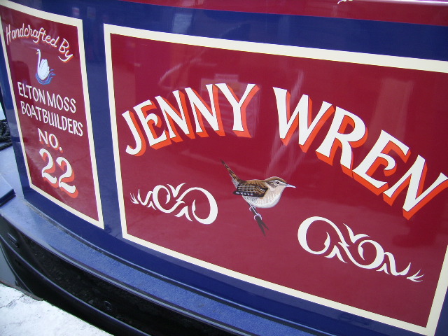
This fairly standard design, usually identical
on both sides of the boat, can be executed in one day. The namepanel includes a cast shadow and straightforward scroll work.
The makers panel includes cast shadows and all ivory colour is double coated. Lining not included. ___________________________
Signwritten at Aqueduct Marina near
Nantwich for Steve Wallace - expert boatpainter (and drummer) - who now works full-time for the marina. This
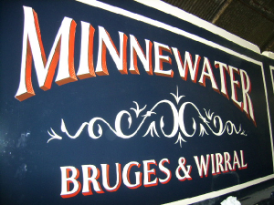
represents another stage up for colour and style. The word 'Minnewater' forms a 'flat topped arch'
shape with the letters remaining perpendicular. The red 'shadow' is in graded shades of red flowing from light
to dark to give a heightened 3D effect. Also, the common addition of significant place names help to personalise
this boat. ____________________________
|

I lettered both these boats on the canalside, amongst others
for 'Carefree Cruising' at Sandbach, to whom I am very grateful for much work in recent years. ___________________________
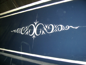
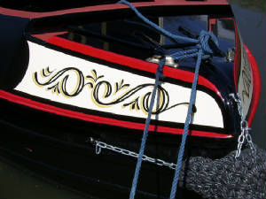
Also on Minnewater, a large empty expanse along
the side cried out to be broken up with something. We ditched the idea of a full colour, full sized, bare breasted
mermaid in favour of this scroll decoration, which echoes the one on the namepanel and is diamond shaped to sit centrally and
neatly along the side. Actually, just how big is a 'full sized' mermaid? ___________________________
|
|
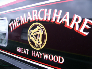
Perhaps a bit cheeky, but this boat appeared here
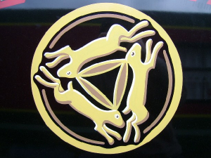
on my site before the owners had taken possession of it. Hope they don't mind. I came across 'TheThree Hares' symbol whilst searching the net for
ideas of suitable images to use on this boat. The owners also came across similar images and so it was settled. ___________________________
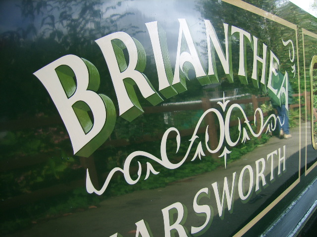
Almost monochromic, in greens.
__________________________
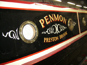
I thought of this 'smile'
shape for the design to 'Penmon' after seeing the potential of using the already attractive portholes by arcing
both top and bottom rows of text and, extending the scroll work out to either side, tapering to points.
___________________________
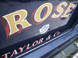
The name 'Rose' being so short and quick to paint prompted me to add a little extra
embellishment. In this case, after the usual graded-tone block shadow, I included an outline for further contrast
__________________________.
__________________________
My version of traditionally styled narrowboat roses. They can be formed into almost any shape, to
fill almost any space.
__________________________
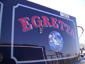
It's unusual to paint the main title in bright red as the colour doesn't cover well.
However, I must have seen fit to do it on this occasion as the red was going to work well with the grey tones and blue background.
Coupled with the Egret, overall was pretty striking. Incidentally if you click the photo to enlarge, it almost appears
as if the bird is standing on the rear seating of the boat reflected in the new paintwork.
___________________________
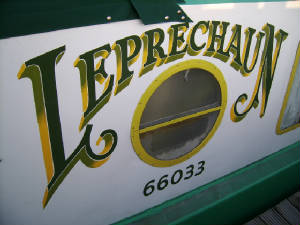
The origins of this one are pretty obvious. I was given a free rein and was
able to come up with this by extending and modifying the shape of the first and last letters. The squashing of the arched
letters in the middle enabled me to get around the porthole and maximize the space at the same time.
___________________________
A lot
of decorative work you see on narrowboats, and on this page are interpretations of traditional designs, images and lettering. I've
been a bit creative here on 'Tamarind,' by modifying a well used scroll design for use as a bow
decoration and I think, can with a little imagination resemble breaking waves.
___________________________
No copying here. Just my own design of a well
familiar image.
___________________________
 |
So, using various collected images as inspiration - I
decided to create my own which I drew geometrically from the triangle formed by the ears, with each hare taking
up an equal space. Finished with an outer circle which I deliberately broke into with the hares' feet so
I could get the hares as large as possible within the given space. ___________________________
Quite pleased with the picture and the balance between
it, the lettering and small scrolls.
__________________________

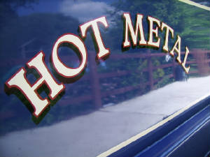
Block-serif lettering, a separate outline and additional shadow in white, red, black and blue make
this quite a vivid example.
___________________________
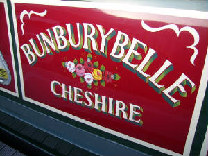
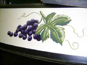
The owners of this boat used to own a cheese shop. They
gave me a design from their stationery to 'scale up', to be painted directly onto the boat. I used
to use this approach in my old job at Don-Bur Bodies & Trailers. Signwriting fleets of large commercial vehicles
for department stores, logistics etc. My favourites being the designs for the breweries and bakeries. In the
90s just before large format printing started to take over, we'd be given the artwork, take measurements, enlarge
to scale then paint, all by hand and it had to be accurate.
__________________________
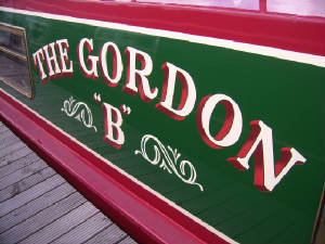
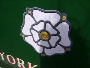
The Yorkshire Rose,
added to 'Gordon B' was from a photo of owners Richard and Carole's stained glass front door panel. I thought
that to have painted it in plain flat colours would have been a bit dull so. I tried to mimic the stained glass effect, as
on 'Egretta' below. Click photos to enlarge.
___________________________
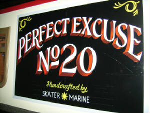
Done in the workshop in one day (both sides) for
Skater Marine of Liverpool.
_________________________
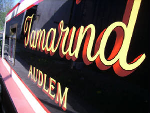
Script style lettering is not so common on boats. It's not always easy to achieve the
balance, especially with more than one line of text. Also, I never do it in an arc it looks odd! This one worked
well in a 'spicy' gold with a red graded shadow. Curry, anyone?
___________________________
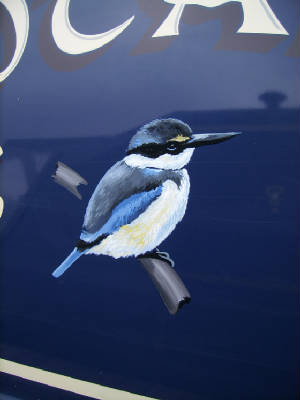
It's called a 'Kotare'. The only
one you're likely to see on the British Canal Network is on this boat of the same name. Why? Because he - or she
- is a New Zealander.
___________________________
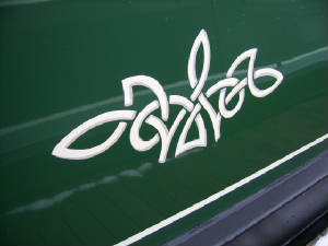
A very rough sketch was provided which I modified and refined in order to execute this 'stand
alone' celtic styled knotwork pattern to 'Little Tern'.
___________________________
 |
